Touch functions #T
Command group to enable touch functions. The module must be equipped with a touch screen. Simple buttons and switches can be used, as well as radio buttons, sliders, bar-graphs and rotary or meter instruments. |
Buttons and switches
Buttons and switches can react to different events: Down, Up, Drag, DoubleClick and LongClick. The command #TCR defines which kind of touch leads to a response (no DoubleClick and LongClick)
The commands #MDT and #MDG can be used to connect macros to the button / switch. When the status changes, the associated macro is called.
Buttons and switches
Place rectangular button (Touch Button Rectangle) |
Obj-ID, ButtonStyle-No., "Text normal"; "Text down"; x, y, Anchor (5), Width(ButtonStyle Width), Height(ButtonStyle Height) |
|
Place rectangular switch (Touch Switch Rectangle) |
Obj-ID, ButtonStyle-No., "Text normal"; "Text down"; x, y, Anchor (5), Width(ButtonStyle Width), Height(ButtonStyle Height) |
|
Place elliptical button (Touch Button Ellipse) |
Obj-ID, ButtonStyle-No., "Text normal"; "Text down"; x, y, Anchor (5), Width(ButtonStyle Width), Height(ButtonStyle Height) |
|
Place elliptical switch (Touch Switch Ellipse) |
Obj-ID, ButtonStyle-No., "Text normal"; "Text down"; x, y, Anchor (5), Width(ButtonStyle Width), Height(ButtonStyle Height) |
|
Place picture button (Touch Button Picture) |
Obj-ID, ButtonStyle-No., "Text normal"; "Text down"; x, y, Anchor (5), Width(ButtonStyle Width), Height(ButtonStyle Height) |
|
Place picture switch (Touch Switch Picture) |
Obj-ID, ButtonStyle-No., "Text normal"; "Text down"; x, y, Anchor (5), Breite(ButtonStyle Width), Height(ButtonStyle Height) |
|
Place label-free icon button (Touch Button Icon) |
Obj-ID, x, y, Anchor, <Button-name normal>, Width normal (0), 'Button-name down' (no change); Height down (0), <Sound-name> |
|
Place label-free icon switch (Touch Switch Icon) |
Obj-ID, x, y, Anchor, <Button-name normal>, Width normal (0), 'Button-name down' (no change); Height down (0), <Sound-name> |
|
Convert object to button (Touch Button Object) |
Obj-ID, ButtonStyle-No., "Text normal"; "Text down"; |
|
Convert object to switch (Touch Switch Object) |
Obj-ID, ButtonStyle-No., "Text normal"; "Text down"; |
Settings of buttons and switches
Change labeling of button/switch (Touch Change Label) |
Obj-ID, "Text normal"; "Text down"; |
|
Change state of button/switch (Touch Change State) |
State, Obj-ID1, ..., Obj-IDn |
|
Activate/ deactivate button/switch (Touch Change Enable) |
Active, Obj-ID1, ..., Obj-IDn |
|
Define feedback from touch events (Touch Change Response) |
Event, 0 , Obj-ID1, ..., Obj-IDn |
Radiogroup
Add button/switch to radio group (Touch Radiougroup Add) |
Group-ID, Obj-ID1, ..., Obj-IDn |
Special touch functions
Internal touch processing (Touch Id Define) |
Mask, Obj-ID1, ..., Obj-IDn |
|
Additional size for Touch Area with Bounding Box Flag (Touch Additional Area) |
Addition left/right, Addition up/down |
|
Place free touch area (Touch Area Free) |
Obj-ID, x, y, Anchor, Width, Height |
|
Setting gesture times (Touch Configure Gesture) |
DoubleClick Time (30), LongClick Time (100) |
|
Global touch on/off (Touch Panel Enable) |
Enable |
#TBR |
Obj-ID, ButtonStyle-No., "Text normal"; "Text down"; x, y, Anchor (5), Width(ButtonStyle Width), Height(ButtonStyle Height) |
#TSR |
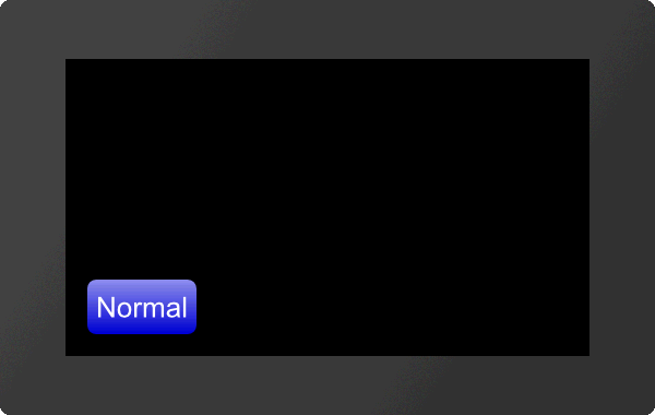
The command places a rectangular button / switch with the given Anchor at the position x, y. The parameter "Text normal" specifies the output in the unpressed state. "Text down" in the pressed state. With the ButtonStyle the appearance of the button / switch is determined (ButtonStyle No.). This is explained in more detail in the ButtonStyle subsection. The Width and Height of the button / switch is taken from the ButtonStyle, but can optionally be overwritten.
|
... #TBR 1,1,"Normal";"Pressed";20,20,7 ... |
#TBE |
Obj-ID, ButtonStyle-No., "Text normal"; "Text down"; x, y, Anchor (5), Width(ButtonStyle Width), Height(ButtonStyle Height) |
#TSE |
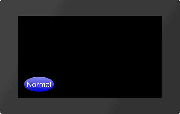
The command places an elliptical button / switch with the given Anchor at the position x, y. The parameter "Text normal" specifies the output in the unpressed state. "Text down" in the pressed state. With the ButtonStyle the appearance of the button / switch is determined (ButtonStyle-No.). This is explained in more detail in the ButtonStyle subsection. The Width (∅ X) and Height (∅ Y) of the button / switch are taken from the ButtonStyle, but can optionally be overwritten.
|
... #TBE 1,1,"Normal";"Pressed";20,20,7 ... |
#TBP |
Obj-ID, ButtonStyle-No., "Text normal"; "Text down"; x, y, Anchor (5), Width(ButtonStyle Width), Height(ButtonStyle Height) |
#TSP |
The command places a button / switch as an image with the given Anchor at position x, y. The parameter "Text normal" specifies the output in the unpressed state. "Text down" in the pressed state. With the ButtonStyle the appearance of the button / switch is determined (ButtonStyle-No.). This is explained in more detail in the ButtonStyle subsection. The Width and Height of the button / switch is taken from the ButtonStyle, but can optionally be overwritten.
|
... #TBP 1,2,"Normal";"Pressed";20,20,7 ... |
Place label-free icon button/switch
#TBI |
Obj-ID, x, y, Anchor, <Button-name normal>, Width normal (0), 'Button-name down' (no change); Height down (0), <Note string> |
#TSI |
The command places a button / switch as an icon with the given Anchor at position x, y. A ButtonStyle is not necessary for this. The two parameters <Buttonname normal> and <Buttonname down> specify the images to be displayed. If no Width (in pixels) or zero is specified, the original size of the image is used. The height is calculated internally (proportional). The last parameter <Note-string> specifies the sound file that is played when touched.
|
... #TBI 1,20,20,7,<P:button/Play.epg>,100,<P:button/Pause.epg>,100 ... |
... #TBI 1,20,20,7,"Play";100,"Pause";100 ... |
#TBO |
Obj-ID, ButtonStyle-No., "Text normal"; "Text down"; |
#TSO |
Any existing object is converted into a button / switch. The ButtonStyle provides additional information (e.g. Sound name). If the object is a graphic primitive (e.g. polygon) with the same DrawSytle as in the ButtonStyle, the DrawStyle of the ButtonStyle is automatically adopted for the pressed state.
|
... #TBO 1,1,"Normal";"Pressed"; ... |
Settings of buttons and switches
Change labeling of button/switch
#TCL |
Obj-ID, "Text normal"; "Text down"; |
The command changes the labeling of touch objects. If no text is specified for the pressed state ("Text down"), "Text normal" is used for both.
|
... #TBR 1,... #TCL 1,"Change"; ... |
#TCS |
State, Obj-ID1, ..., Obj-IDn |
The command changes the state of the touch objects (Obj-ID1, ..., Obj-IDn):
State |
|
1 |
unpressed |
2 |
pressed |
|
... #TBI 1,20,20,7,<P:button/Play.epg>,100,<P:button/Pause.epg>,100 #TCS 2,1 ... |
Activate/ deactivate button/switch
#TCE |
Active, Obj-ID1, ..., Obj-IDn |
The command activates or deactivates touch objects (Obj-ID1, ..., Obj-IDn) (Active):
Active |
|
0 |
not active |
1 |
active |
|
... #TBR 1,... #TCE 0,1 ... |
Define feedback from touch events
#TCR |
Event, 0, Obj-ID1, ..., Obj-IDn |
Each touch object may run a macro. A distinction is made between three events: up, down and drag. For each of these events it can be set individually whether it triggers a feedback or not. This can be set with the Event parameter. The event is bit coded according to the following table:
Event |
||||||||
0 |
1 |
2 |
3 |
4 |
5 |
6 |
7 |
|
Up |
● |
● |
● |
● |
||||
Down |
● |
● |
● |
● |
||||
Drag |
● |
● |
● |
● |
||||
If you only want to receive feedback for up and down events, set the Event parameter to 3.
Default settings |
|
Button |
#TCR 2,0,Obj-ID |
Switch |
#TCR 3,0,Obj-ID |
Bargraph/Instrument |
#TCR 1,0,Obj-ID |
Editbox |
#TCR 1,0,Obj-ID |
Radiogroup
Add button/switch to radio group
#TRA |
Group-ID, Obj-ID1, ..., Obj-IDn |
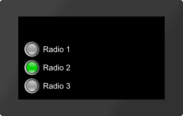
One or more switches (Obj-ID, ..., Obj-IDn) are added to an existing or new radio group (Group-ID).
|
... #TSP 1,2,"Radio 1";"Radio 1";20,140,7 #TSP 2,2,"Radio 2";"Radio 2";20,80,7 #TSP 3,2,"Radio 3";"Radio 3";20,20,7 #TRA 4,1,2,3 ... |
Special touch functions
#TID |
Mask, Obj-ID1, ..., Obj-IDn |
A special touch action can be assigned to each object (Obj-ID) or touch input can be enabled. The individual bits of the Mask can be combined with bit decoding, that multiple touch actions are possible at the same time:
Mask |
|
1 |
Internal processing (e.g. Bargraphs / Instruments / EditBoxes) |
2 |
Move (object can be moved by touching and dragging) |
4 |
Object can be enlarged/reduced proportionally |
8 |
Object can be rotated around the active anchor |
16 |
Size change with two fingers |
32 |
Rotate with two fingers |
64 |
Use only object's bounding box |
128 |
Object remains unchanged, touch macros are executed |
Additional size for Touch Area with Bounding Box Flag (from V1.1)
#TAA |
Addition left/right, Addition up/down |
This command increases the sensitivity for touch surfaces. However, the flag (Use object's Bounding Box only) must be set (see command #TID). Only the Bounding Box and not the shape of the object is used for touch recognition. The two parameters Addition Left/Right and Addition Top/Bottom specify by how many pixels the sensitivity of the respective touch area (Bounding Box) should be enlarged.
#TAF |
Obj-ID, x, y, Anchor, Width, Height |
The command places a free touch area with the given Anchor, Width and Height at the position x, y.
#TCG |
DoubleClick Time, LongClick Time |
The command sets the time threshold of gestures. The DoubleClick Time specifies in 1 / 100s the maximum time that can pass between two down events, so that a valid double click is still recognized. The parameter LongClick Time determines which time span (in 1 / 100s) must elapse at least for a LongClick to be detected.
The valid range for DoubleClick is 20 (=200 ms) to 100 (=1 sec.), for LongClick it is valid for 30 (=300 ms) to 1000 (=10 sec.).
#TCE |
Enable |
Command that globally enables (Enable =1) or disables (=0) the touch functionality. After the restart the touch panel is active.


