Size must be set to 0 as size is given by picture font directly and Alignment.
Alignment |
|
0 |
Left |
1 |
Center |
2 |
Right |
Specifying the alignment is only useful for multiline texts. The position of the text object itself is determined by the anchor (e.g. anchors 3, 6, and 9 for right-aligned).
The DrawStyle specifies the color. For performance reasons, we recommend simple filling without an outline. . The remaining two parameters specify the LineSpacing and additional CharacterSpacing.
#CTN |
TextStyle-No, <FontName> |
The command changes the font (<FontName>) of the TextStyle.
#CTA |
TextStyle-No, Alignment |
The command changes the Alignment of the text.
Alignment |
|
0 |
Left |
1 |
Center |
2 |
Right |
#CTC |
TextStyle, DrawStyle-No |
Change color using the DrawStyle (DrawStyle No.).
#CTG |
TextStyle, LineSpace, CharacterSpace (no change) |
An additional LineSpacing or CharacterSpacing is defined (in % of the character height). Negative values are also allowed.
#CTW |
TextStyle-No, SpaceCode, SpaceWidth(100) |
The width of the space can be taken from any other code (SpaceCode). The width can also be defined in %: Standard: 100 (SpaceWidth).
ButtonStyle
#CBP |
ButtonStyle-No, <ButtonNameNormal>, <ButtonNameDown> (=Normal), Width(0), Height(0) |
The command defines a ButtonStyle: Display two images for the unpressed (<ButtonNameNormal>) and pressed (<ButtonNameDown>) state. The size is determined by Width and Height (= 0 original size).
#CBD |
ButtonStyle-No, DrawStyle-Normal, DrawStyle-Down (=Normal), Width (0), Height (0), Radius(0) |
The command defines a ButtonStyle: Display of two DrawStyles for the unpressed (DrawStyleNormal) and pressed (DrawStyleDown) state. The following are further parameters for the Width and Height of the button and the corner rounding (Radius).
#CBT |
ButtonStyle-No, TextStyleNormal, TextStyleDown (=Normal), OffsetX(0), OffsetY(0) |
Define the text of the button style. The Offset specifies an additional distance in pixels where the text is positioned on the button.
#CBO |
ButtonStyle-No, OffsetX(0), OffsetY (=OffsetX), Size(100), Angle(0) |
The behaviour of the button when pressed is defined. The button is drawn with the Offset (in pixels). The Size changes proportionally as a percentage. The Angle (in degrees) can also be changed.
#CBS |
ButtonStyle-No, <SoundString> |
A short tone sequence ("Sound string") is played in the DownEvent of the ButtonStyle. If the parameter "Sound string" is empty, the jingle is deleted.
#CBG |
ButtonStyle-No, R (-30), G (=R), B (=R) |
The deactivated state of a button is the percentage change in color of the ButtonStyle normal. Each color channel can be addressed individually. The Opacity can also be changed.
ColorRamp
#CCR |
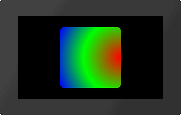
ColorRamp-No, Offset1, RGB1, Transparency1, ... Offset10, RGB10, Transparancy10 |
The command defines a gradient. The base point (Offset) defines the color point in the course in percent, the color is indicated by RGB and Opacity. A maximum of 10 control points can be specified.
#CAC |
ColorRamp-No, Type (1), Time (100) |
The position of the vertices of the gradient are changed. The type specifies the animation type. Time in 1/100 s indicates the duration.
Type |
|
0 |
Stop animation |
1 |
Cyclic |
2 |
Cyclic backward |
3 |
PingPong |
4 |
PingPong backward |
|
... #CCR 5,0,$FF0000,100,50,$00FF00,100,100,$0000FF,100 #CFR 15,5,5000,6 #CAC 5,3 ... |