Input element per Touch #E
Commands to create touch input elements like menus, SpinBoxes or ComboBoxes. The functions are available from firmware V1.2.
The functions around the PictureBox are available from firmware V1.6.
Menu
Define styles for menu (Input Menu Styles) |
Obj-ID, MenuDirection, TextStyle-No., DrawStyle-No. Background, DrawStyle-No. Selection, DrawStyle-No. Icon, <Soundfile> |
|
Define entries for menu (Input Menu Define) |
Obj-ID, ItemNumber, "Entry" |
|
Assign icon to menu entry (Input Menu Icons) |
Obj-ID, ItemNumber, <Iconname>, ItemNumber2, <Iconname2>, ... ItemNumberN, <IconnameN> |
|
Enable/Disable menu entry (Input Menu Enable) |
Obj-ID, Enable, ItemNumber, ItemNumber2, ... ItemNumberN |
|
Check/Uncheck menu entry (Input Menu Check) |
Obj-ID, Check, ItemNumber, ItemNumber2, ... ItemNumberN |
|
Place and show menu (Input Menu Place) |
Obj-ID, x, y, Anchor, Radius(0), BorderX(0), BorderY(0), Time(0) |
|
Select menu entry (Input Menu choOse) |
Obj-ID, ItemNumber |
ComboBox
Define styles for ComboBox (Input Comobox Styles) |
Obj-ID, ComboBoxDirection, TextStyle-No., DrawStyle-No. Background, DrawStyle-No. Selection, DrawStyle-No. Scrollbar, <Soundfile> |
|
Define entries for ComboBox (Input Comobox Define) |
Obj-ID, "Entries" |
|
Obj-ID, "Formatted string"; StartValue, EndValue |
||
Add entries for ComboBox (Input Comobox Add) |
Obj-ID, "Entries" |
|
Obj-ID, "Formatted string"; StartValue, EndValue |
||
Assign icon to ComboBox entry (Input Comobox Icons) |
Obj-ID, ItemNumber, <Iconname>, ItemNumber2, <Iconname2>, ... ItemNumberN, <IconnameN> |
|
Enable/ Disable ComboBox entry (Input Comobox Enable) |
Obj-ID, Enable, ItemNumber, ItemNumber2, ... ItemNumberN |
|
Place and show ComboBox (Input Comobox Place) |
Obj-ID, x, y, Anchor, Radius(0), Width(0), VisiableEntries(0), BorderX(0),BorderY(0), Time(0) |
|
Select ComboBox entry (Input Comobox choOse) |
Obj-ID, ItemNumber |
SpinBox
Define styles for SpinBox (Input Spinbox Styles) |
Obj-ID, RollingBehaviour, TextStyle-No., DrawStyle-No. Background, DrawStyle-Nr. Selection, <Soundfile> |
|
Define entries for SpinBox (Input Spinbox Define) |
Obj-ID, Box-Nr, "Entries" |
|
Obj-ID, Box-Nr, "Formatted string"; StartValue, EndValue |
||
Add entries for SpinBox (Input Spinbox Add) |
Obj-ID, Box-Nr, "Entries" |
|
Obj-ID, Box-Nr, "Formatted string"; StartValue, EndValue |
||
Assign icon to SpinBox entry (Input Spinbox Icons) |
Obj-ID, ItemNumber, <Iconname>, ItemNumber2, <Iconname2>, ... ItemNumberN, <IconnameN> |
|
Enable/Disable SpinBox entry (Input Spinbox Enable) |
Obj-ID, Enable, ItemNumber, ItemNumber2, ... ItemNumberN |
|
Place and show SpinBox (Input Spinbox Place) |
Obj-ID, x, y, Anchor, Radius, Width, VisibleEntries, BorderX(0), Distance(0) |
|
Select SpinBox entry (Input Spinbox choOse) |
Obj-ID, ItemNumber |
PictureBox
Define styles for PictureBox (Input PictureBox Styles) |
Obj-ID, Type, Iconanchor, Textanchor, TextStyle-No., DrawStyle-No. Background, DrawStyle-No. Selection, DrawStyle-No. Scrollbar, <Soundfilei> |
|
Define entries for PictureBox (Input PictureBox Define) |
Obj-ID, Width, Height, <Iconname>, Label; <Iconname2>, Label2;...<IconnameN>, LabelN; |
|
Add entries to PictureBox (Input PictureBox Add) |
Obj-ID, <Iconname>, Label; <Iconname2>, Label2;...<IconnameN>, LabelN; |
|
Enable/Disable PictureBox entry (Input PictureBox Enable) |
Obj-ID, Enable, ItemNumber, ItemNumber2, ... ItemNumberN |
|
Place and show PictureBox (Input PictureBox Place) |
Obj-ID, x, y, Anchor, Radius, ScrollbarWidth, VisibleEntries, DistanceX, DistanceY, Time(0) |
|
PictureBox-Eintrag selektieren (Input PictureBox choOse) |
Obj-ID, ItemNumber |
Menu
|
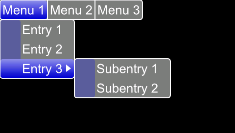
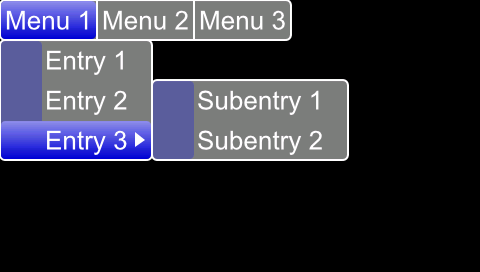
... #EMS 1,0,4,1,5,17 #EMD 1,0,"Menu 1||Menu 2||Menu 3"; #EMD 1,1,"Entry 1|Entry 2|Entry 3"; #EMD 1,769,"Subentry 1|Subentry 2"; #EMP 1,0,271,1,5,5,5,10 ... |
#EMS |
Obj-ID, MenuDirection, TextStyle-No., DrawStyle-No. Background, DrawStyle-No. Selection, DrawStyle-No. Icon, <Note string> |
The command determines the appearance of the menu. Three DrawStyles are required. The background of the menu (DrawStyle-No. Background), the appearance of the selected entry (DrawStyle-No. Selection) and the background of the icon (DrawStyle-No. Icon) are defined. The structure is described in more detail in the subsection DrawStyle. The appearance of the character string is determined with the TextStyle (TextStyle No.). This is explained in more detail in the TextStyle subsection. The direction in which the menu is pulled-down is also set (MenuDirection).
MenuDirection |
||||||||
0 |
1 |
2 |
3 |
4 |
5 |
6 |
7 |
|
Direction |
bottom/right |
top/right |
bottom/left |
top/left |
bottom/right |
top/right |
bottom/left |
top/left |
normal |
save space |
|||||||
|
|
|||||||
Finally, the parameter "Note string" can optionally be set. This specifies the note string to be played, while pressing.
#EMD |
Obj-ID, ItemNumber, "Entry" |
The command adds sub-menus to the parent object. The main menu has the ItemNumber 0, the main menu entries $ 01 - $ FF. The submenu entries are assigned with the next higher byte (e.g. $ 0301 assigns further subentries to the third entry of the first menu entry).
Main menu 1 $01 |
Main menu 2 $02 |
Main menu 3 $03 |
... |
Menu 1 $01 01 |
|||
Menu 2 $02 01 |
|||
Menu 3 $03 01 |
Sub-menu 1 $01 03 01 |
||
... |
Sub-menu 2 $02 03 01 |
||
... |
|||
The individual entries are displayed as a string ("Entry") with a pipe '|' handed over separately. A double pipe '||' adds a hyphen / separator.
#EMI |
Obj-ID, ItemNumber, <Iconname>, ItemNumber2, <Iconname2>, ... ItemNumberN, <IconnameN> |
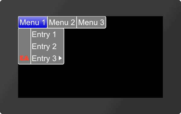
An icon can be assigned to each entry (ItemNumber) <Iconname>. In order for an icon to be assigned, the entry must already exist.
|
... #EMI 1,$0301,<P:picture/EA.epg> ... |
... #EMI 1,$0301,"EA"; ... |
#EME |
Obj-ID, Enable, ItemNumber, ItemNumber2, ... ItemNumberN |
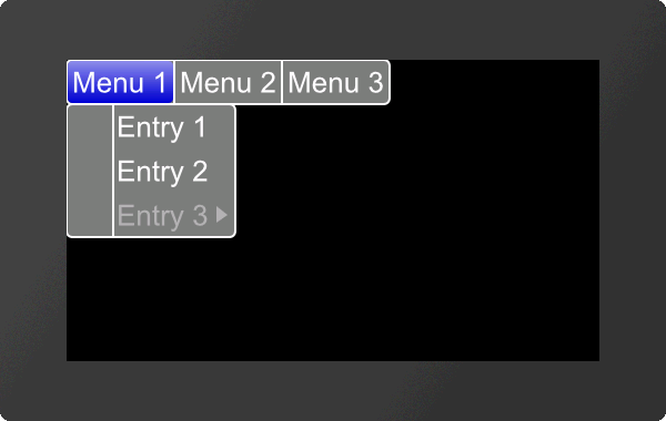
The command activates/deactivates an entry (ItemNummer). If an entry is deactivated, it cannot be selected by touch. By default, all entries are active.
Enable |
|
0 |
Disable |
1 |
Enable |
2 |
Toggle |
|
... #EME 1,0,$0301 ... |
#EMC |
Obj-ID, Check, ItemNumber, ItemNumber2, ... ItemNumberN |
The command selects / deselects an entry (ItemNummer). A check mark is displayed visually. No entry is selected by default.
Check |
|
0 |
Deselect |
1 |
Select |
2 |
Toggle |
|
... #EMC 1,1,$0301 ... |
#EMP |
Obj-ID, x, y, Anchor, Radius(0), BorderX(0), BorderY(0), Time(0) |
The menu defined with the commands #EMS and #EMD is placed with the given Anchor at x, y. The Radius parameter gives the corner rounding. With the two optional parameters (BorderX and BorderY) the distance of the text to the edge of the menu is specified. With the parameter Time the opening / closing of the menu can be animated in 1/100s.
#EMO |
Obj-ID, ItemNumber |
The command selects an entry (ItemNummer).
ComboBox
#ECS |
Obj-ID, ComboBoxDirection, TextStyle-No., DrawStyle-No. Background, DrawStyle-No. Selection, DrawStyle-No. Scrollbar, <Note string> |
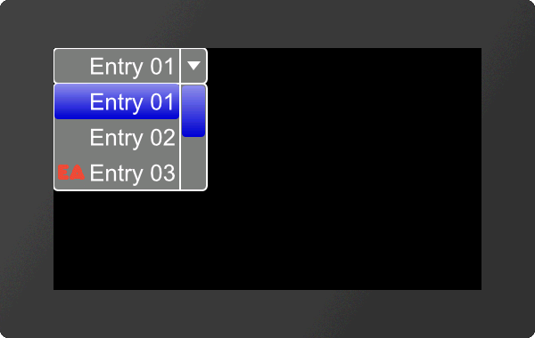
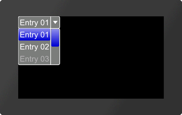
The command defines the appearance of the ComboBox. Three DrawStyles are required. The background of the ComboBox (DrawStyle-No. Background), the appearance of the selected entry (DrawStyle-No. Selection) and the the scrollbar (DrawStyle No. Scrollbar) are defined. The structure is described in more detail in the subsection DrawStyle. The appearance of the character string is determined with the TextStyle (TextStyle No.). This is explained in more detail in the TextStyle subsection. The direction in which the ComboBox is pulled-down is also set (ComboBoxDirection).
ComboBoxDirection |
|
0 |
Down |
1 |
Up |
Finally, the parameter "Note string" can optionally be set. This specifies the note string to be played, while pressing.
#ECD |
Obj-ID, "Entries" |
Obj-ID, "Formatted string"; StartValue, EndValue |
There are two ways to transfer the ComboBox entries:
- The individual entries are displayed as a string ("Entries") with a pipe '|' passed separately (e.g. "Entry1|Entry2|Entry3";)
- The individual entries are transferred as a format string with start and end values (e.g. "Entry %d";1,3)
Add entries for ComboBox (from V1.3)
#ECA |
Obj-ID, "Entries" |
Obj-ID, "Formatted string"; StartValue, EndValue |
The command adds entries to an existing ComboBox.
There are two ways to transfer the ComboBox entries:
- The individual entries are displayed as a string ("Entries") with a pipe '|' passed separately (e.g. "Entry1|Entry2|Entry3";)
- The individual entries are transferred as a format string with start and end values (e.g. "Entry %d";1,3)
#ECI |
Obj-ID, ItemNumber, <Iconname>, ItemNumber2, <Iconname2>, ... ItemNumberN, <IconnameN> |
An icon can be assigned to each entry (ItemNumber) <Iconname>. The entry must already exist.
|
... #ECI 1,3,<P:picture/EA.epg> ... |
... #ECI 1,3,"EA"; ... |
Enable/ Disable ComboBox entry
#ECE |
Obj-ID, Enable, ItemNumber, ItemNumber2, ... ItemNumberN |
The command activates / deactivates an entry (ItemNumber). If an entry is deactivated, it cannot be selected by touch. By default, all entries are active.
Enable |
|
0 |
Disable |
1 |
Enable |
2 |
Toggle |
|
... #ECE 1,0,3 ... |
#ECP |
Obj-ID, x, y, Anchor, Radius(0), Width(0), VisiableEntries(0), BorderX(0),BorderY(0), Time(0) |
The ComboBox defined with the commands #ECS and #ECD is placed in with the given Anchor at x, y. The Radius parameter gives the corner rounding. Width indicates the width of the box in pixels. If width = 0, the width of the box is automatically determined based on the widest entry.
The parameter VisibleEntries defines the number of visible entries (VisibleEntries = 0: all entries visible). With the two optional parameters (BorderX and BorderY) the distance of the text to the edge of the menu can be specified. With the parameter Time the opening / closing of the ComboBox can be animated in 1/100s.
#ECO |
Obj-ID, ItemNumber |
The command selects an entry (ItemNumber).
SpinBox
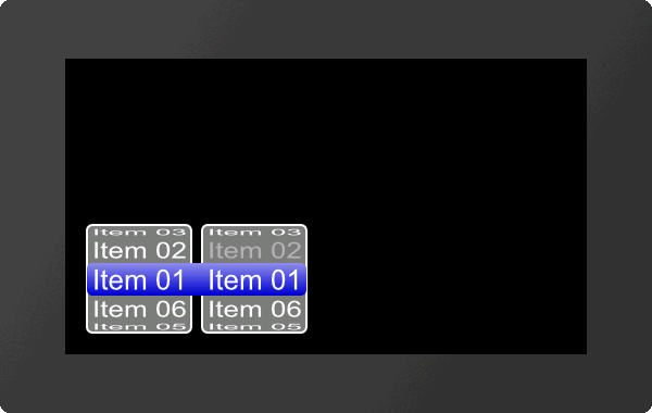
|
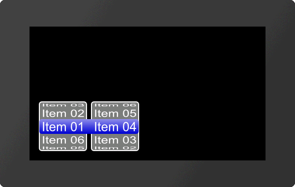
... #ESS 1,0,4,1,5 #ESD 1,1,"Item %02d";1,6 #ESD 1,2,"Item %02d";1,6 #ESP 1,20,20,7,5,0,5,5,10 #ESO 1,$0400 ... |
#ESS |
Obj-ID, RollingBehaviour, TextStyle-No., DrawStyle-No. Background, DrawStyle-Nr. Selection, <Note string> |
The command defines the appearance of the SpinBox. Two DrawStyles are required. The background of the SpinBox (DrawStyle-No. Background) and the appearance of the selected entry (DrawStyle-No. Selection) are defined. The structure is described in more detail in the DrawStyle subsection. The appearance of the character string is determined with the TextStyle (TextStyle-No.). This is explained in more detail in the TextStyle subsection. The RollingBehavior position of the selection frame of the SpinBox is also defined here:
RollingBehaiviour |
||||
0 |
1 |
2 |
3 |
|
RollingBehaiviour |
Endless |
With stop |
Endless |
With stop |
Selection frame |
Behind the text |
Before the text |
||
Finally, the parameter "Note string" can optionally be set. This specifies the note string to be played, while pressing.
#ESD |
Obj-ID, Box-Nr, "Entries" |
Obj-ID, Box-Nr, "Formatted string"; StartValue, EndValue |
A SpinBox can have up to 4 subordinate boxes. The parameter Box-No. indicates the current box.
There are two ways to transfer the entries of the SpinBox:
- The individual entries are displayed as a string ("Entries") with a pipe '|' passed separately (e.g. "Entry1|Entry2|Entry3";)
- The individual entries are transferred as a format string with start and end values (e.g. "Entry %d";1,3)
Add entries for SpinBox (from V1.7)
#ESA |
Obj-ID, Box-Nr, "Entries" |
Obj-ID, Box-Nr, "Formatted string"; StartValue, EndValue |
The command adds entries to an existing SpinBox.
A SpinBox can have up to 4 subordinate boxes. The parameter Box-No. indicates the current box.
There are two ways to transfer the entries of the SpinBox:
- The individual entries are displayed as a string ("Entries") with a pipe '|' passed separately (e.g. "Entry1|Entry2|Entry3";)
- The individual entries are transferred as a format string with start and end values (e.g. "Entry %d";1,3)
#ESI |
Obj-ID, ItemNumber, <Iconname>, ItemNumber2, <Iconname2>, ... ItemNumberN, <IconnameN> |
An icon can be assigned to each entry <Iconname>. To assign an icon, the entry must already exist.
ItemNumber is composed as follows:
Box 1 |
Box 2 |
Box 3 |
Box 4 |
|
Item 1 |
$01 |
$01 00 |
$01 00 00 |
$01 00 00 00 |
Item 2 |
$02 |
$02 00 |
$02 00 00 |
$02 00 00 00 |
Item 3 |
$03 |
$03 00 |
$03 00 00 |
$03 00 00 00 |
... |
||||
|
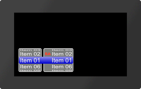
... #ESI 1,$0200,<P:picture/EA.epg> ... |
... #ESI 1,$0200,"EA"; ... |
#ESE |
Obj-ID, Enable, ItemNumber, ItemNumber2, ... ItemNumberN |
The command activates / deactivates an entry (ItemNumber). If an entry is deactivated, it cannot be selected by touch. By default, all entries are active.
Enable |
|
0 |
Disable |
1 |
Enable |
2 |
Toggle |
|
... #ESE 1,0,$0200 ... |
#ESP |
Obj-ID, x, y, Anchor, Radius, Width, VisiableEntries, BorderX(0), Distance(0) |
The SpinBox defined with the commands #ESS and #ESD is placed with the given Anchor at x, y. The Radius parameter gives the corner rounding. Width indicates the width of the box in pixels. If width = 0, the width of the box is automatically determined based on the widest entry.
The parameter VisibleEntries defines the upper count of entries to be displayed (example above: 2). Attention: if there are less entries than (2*VisibleEntries+1), then height of SpinBox will be reduced automatically. BorderX specifies the distance between the entry and the box edge and the icon. Distance defines the distance of the boxes within the SpinBox group.
#ESO |
Obj-ID, ItemNumber |
The command selects an entry (ItemNumber).
PictureBox
|
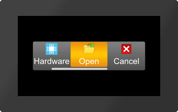
... #EPS 1,768,8,2,6,22,21,20 #EPD 1,40,40 #EPA 1,<P:picture/Calendar.evg> "Calendar" #EPA 1,<P:picture/Hardware.evg> "Hardware" #EPA 1,<P:picture/Open.evg> "Open" #EPA 1,<P:picture/Cancel.evg> "Cancel" #EPA 1,<P:picture/Save.evg> "Save" #EPA 1,<P:picture/Options.evg> "Options" #EPP 1,240,136,5,5,-10,3,3,5,10 ... |
For the creation of the PictureBox we recommend the use of our SoftwareTool uniTFTDesigner.
Define styles for
PictureBox (from V1.2)
#EPS |
Obj-ID, Type, Iconanchor, Textanchor, TextStyle-No., DrawStyle-No. Background, DrawStyle-No. Selection, DrawStyle-No. Scrollbar, <Note string> |
The command sets the appearance of the PictureBox. Three DrawStyles are required. The background of the PictreBox (DrawStyle-No. Background), the appearance of the selected entry (DrawStyle-No. Selection) and the scrollbar (DrawStyle No. Scrollbar) are defined. The structure is described in more detail in the subsection DrawStyle. The appearance of the label is determined with the TextStyle (TextStyle No.). This is explained in more detail in the TextStyle subsection. The second parameter Type specifies the alignment and scrolling behaviour. The touch hysteresis can be specified in the HighByte, i.e. how many pixels shift are needed until a shift is actually recognized, a value of 3 is useful by default.
Typ |
|||
0 |
Entry wise scrolling horizontal |
2 |
fine scrolling horizontal |
1 |
Entry wise scrolling vertical |
3 |
fine scrolling vertical |
Both anchors Iconanchor and Textanchor specify the alignment of text image.
Finally, the parameter "Note string" can optionally be set. This specifies the note string to be played, while pressing.
Define entries for PictureBox (from V1.2)
#EPD |
Obj-ID, Width, Height, <Iconname>, Label; <Iconname2>, Label2;...<IconnameN>, LabelN; |
This command sets the icon size for all entries with the width and height parameters in pixels. Optionally, icons and their labels can be specified.
Add entries to
PictureBox (from V1.2)
#EPA |
Obj-ID, <Iconname>, Label; <Iconname2>, Label2;...<IconnameN>, LabelN; |
This command can be used to add another entry. It is possible to specify an empty path or an empty label string if you do not want an icon / label for this entry.
Enable/ Disable PictureBox entry (from V1.2)
#EPE |
Obj-ID, Enable, ItemNumber, ItemNumber2, ... ItemNumberN |
The command activates / deactivates an entry (ItemNumber). If an entry is deactivated, it cannot be selected by touch. By default, all entries are active.
Enable |
|
0 |
Disable |
1 |
Enable |
2 |
Toggle |
|
... #EPE 1,0,2 ... |
Place and show PictureBox (from V1.2)
#EPP |
Obj-ID, x, y, Anchor, Radius, ScrollbarWidth, VisibleEntries, DistanceX, DistanceY, Time(0) |
The PictureBox defined with the commands #EPSand #EPD is placed in with the given Anchor at x, y. The Radius parameter gives the corner rounding. ScrollbarWidth specifies in pixels the width of the scrollbar. The width +256 changes the position of the scrollbar to the left or top. If the value is negative, no line is present as a separator between the box and the scroll area. The VisibleEntries parameter defines the number of visible entries. The two parameters (DistanceX and DistanceY) can be used to specify the distance of the entry to the edge of the box and below the individual entries. The parameter Time can be used to define the scrolling speed to a programmatically selected new entry.
Select PictureBox entry (from V1.2)
#EPO |
Obj-ID, ItemNumber |
The command selects a new entry (ItemNumber).


